What you will accomplish
A named business role is mapped to the intended launchpad content and verified with a safe test user.
Use this guide when a user can open a launchpad but cannot see or use the intended app. It keeps business ownership, catalog assignment and final validation in one conversation.
Before you start
- A non-production tenant or approved test client
- A named business owner for the task
- Permission to inspect—not broadly change—existing roles
Tutorial content
Think in tasks, not tiles
A missing tile is often only the visible symptom. Start by asking what a person must accomplish, in which company or organizational scope, and which application owns that task.
This lets the functional owner and security administrator agree on a testable outcome before opening role maintenance.
- Business task and target persona named
- Expected app, catalog, and system client recorded
- Existing role is inspected before a new role is proposed
Keep the access change small
Reuse an approved role pattern where it fits. If a catalog or space assignment changes, keep the transport, approver, test evidence and business owner visible together.
Avoid using a powerful administrator role as proof that the final access design is correct.
Reading path
Record the business task, target user group and the exact Fiori app or tile expected.
Checkpoint: The request describes an outcome, not only a missing tile.Check the relevant business role, catalogs and spaces/pages before creating anything new.
Checkpoint: You can explain which assignment is missing or incorrect.Apply the change through the team’s established transport and approval process.
Checkpoint: The change is traceable to a role and transport request.Validate visibility and the allowed task in a test account; check that unrelated access did not expand.
Checkpoint: The owner confirms the task works and scope is unchanged.GitHub source document
Open on GitHub

SwiftUI implementation of the SAP Fiori for iOS Design Language



This project is the SwiftUI implementation of the SAP Fiori for iOS Design Language, and is meant to augment and in some cases replace the UIKit-based implementation contained in the SAPFiori framework of the SAP BTP SDK for iOS.
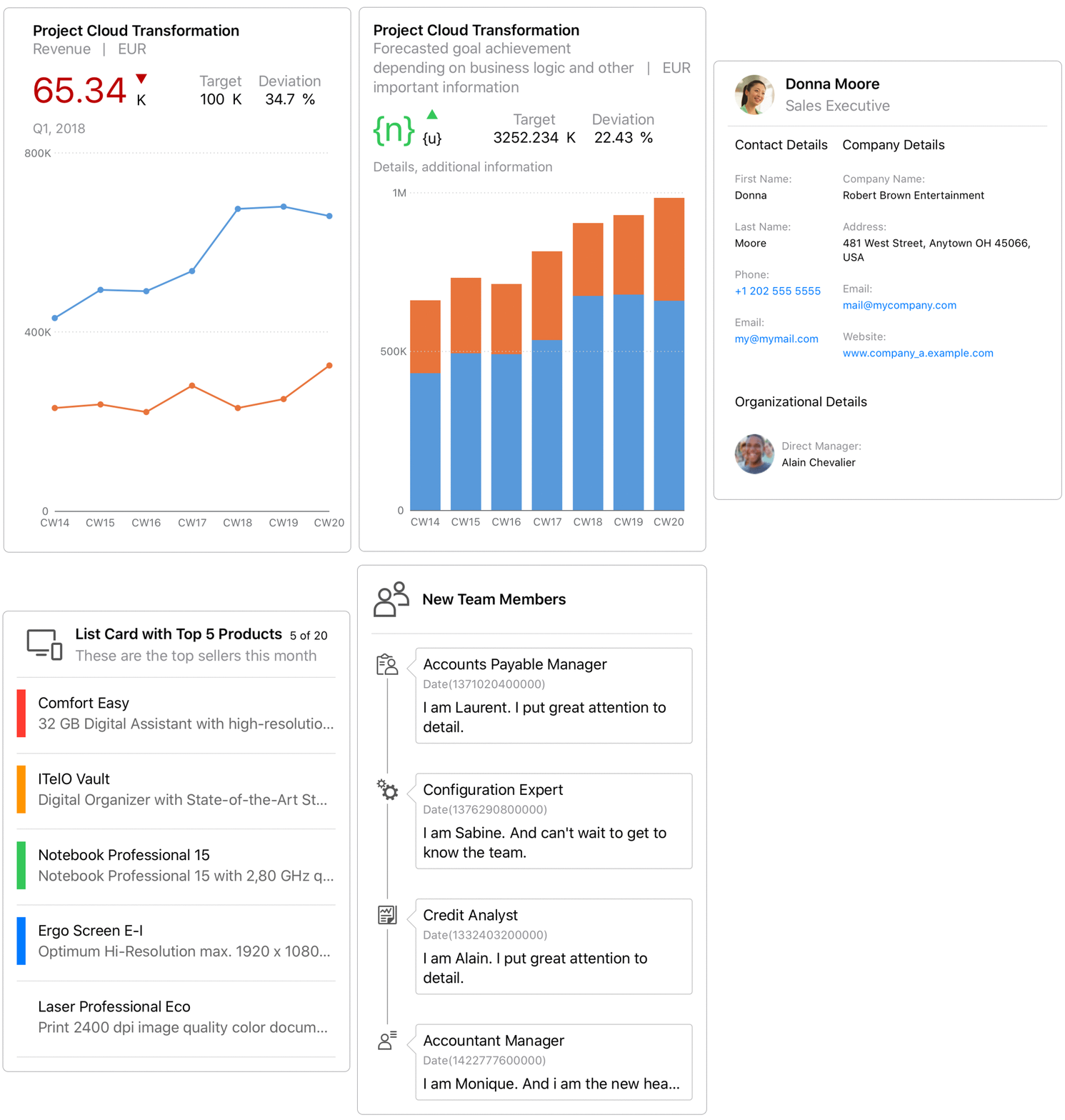
This project currently contains three modules: FioriThemeManager, FioriSwiftUICore, and FioriCharts.
FioriThemeManager

This module provides a color palette and a new font family SAP 72 that conform to Fiori Design Language. It is adopted by all the Fiori components in both this package and SAPFiori.
All Fiori Colors are dynamic colors, which means they will adjust based on iOS Appearance settings (Light/Dark). Accessing Fiori Color using Color.preferredFioriColor(forStyle:).
72 is a SAP patent typeface that delivers great reading experience to our users. You can get these fonts using Font.fiori(forTextStyle:) or Font.fioriCondensed(forTextStyle:). Note that these fonts support Dynamic Type out of the box. If you want the fonts with fixed size, use Font.fiori(fixedSize:) or Font.fioriCondensed(fixedSize:) instead.
Custom fonts need to be loaded and registered during App's runtime. Make sure you call
Font.registerFioriFonts()insideapplication(_:didFinishLaunchingWithOptions:)of yourAppDelegate.
FioriSwiftUICore

This module contains SwiftUI implementation for those UIKit-based components existing in SAPFiori. It provides you with an easy way to migrate your UIKit project to SwiftUI while delivering the same experience as before.
We plan to progressively bring more Fiori UI components into this module in the future releases. Check the table below for the components that are currently available and those in the roadmap.
Refer to this document for different ways of initializing the component.
| FioriSwiftUICore | |
|---|---|
| ObjectItem | :white_check_mark: |
| ObjectHeader | :white_check_mark: |
| KPIItem | :white_check_mark: |
| FioriButton | :white_check_mark: |
| ListPickerItem | :white_check_mark: |
| DimensionSelector | :white_check_mark: |
| SideBar | :white_check_mark: |
| DataTable | :white_check_mark: |
| WelcomeScreen | :white_check_mark: |
| ActivationScreen | :white_check_mark: |
| InfoView | :white_check_mark: |
| User Consent Form | :white_check_mark: |
| KPIProgressItem | :white_check_mark: |
| EULAView | :white_check_mark: |
| ContactItem | :white_check_mark: |
| KPIHeader | :white_check_mark: |
| Signature Capture | :white_check_mark: |
| DurationPicker | :white_check_mark: |
| StepProgressIndicator | :white_check_mark: |
| Text Input | :white_check_mark: |
| Validation View | :white_check_mark: |
| Card | :white_check_mark: |
| Toolbar | :white_check_mark: |
| Search | :white_check_mark: |
| Tab Bar | :white_check_mark: |
| Navigation Bar | :white_check_mark: |
| Stepper | :white_check_mark: |
| Switch | :white_check_mark: |
| Tag | :white_check_mark: |
| Avatar | :white_check_mark: |
| Toast Message | :white_check_mark: |
| KeyValueItem | :white_check_mark: |
| LinearProgressIndicator | :white_check_mark: |
| Information View | :white_check_mark: |
| TextFieldFormView | :white_check_mark: |
| NoteFormView | :white_check_mark: |
| KeyValueFormView | :white_check_mark: |
| TitleFormView | :white_check_mark: |
| Rating Control | :white_check_mark: |
| RatingControlFormView | :white_check_mark: |
| SortFilter | :white_check_mark: |
| Menu Selection | :white_check_mark: |
| ProfileHeader | :white_check_mark: |
| TimelineItem | :white_check_mark: |
| SegmentedControlPicker | :white_check_mark: |
| TimelinePreviewItem | :white_check_mark: |
| DateTimePicker | :white_check_mark: |
| Illustration Message | :white_check_mark: |
| Slider(single and range) | :white_check_mark: |
| Attachment | :white_check_mark: |
| FilterFeedbackBar | :white_check_mark: |
| Switch FormCell | :white_check_mark: |
| Onboarding Scan View | :white_check_mark: |
| Section Header | :white_check_mark: |
| ChartFloorplan | :x: |
| CollectionItem | :x: |
| BarcodeScanner | :white_check_mark: |
| PasscodeView | :x: |
| MultiUserPasscodeView | :x: |
| TouchIDErrorView | :x: |
| Skeleton Loading | :white_check_mark: |
| Value Picker | :white_check_mark: |
| Hierarchy View | :white_check_mark: |
| Calendar | :white_check_mark: |
| Search To Select | :x: |
| Progress Indicator | :white_check_mark: |
| Processing Indicator | :white_check_mark: |
| Checkout Indicator | :white_check_mark: |
| Loading Indicator | :white_check_mark: |
| Feedback Screen | :x: |
| Map | :x: |
| Theming support for UI component individual fields | :x: |
FioriCharts
The FioriCharts module replaces the RoambiChartKit charting library which was already embedded in SAPFiori. Migrating to SwiftUI gives the ability to easily add new chart components (donut, bullet, stocks, etc.) while modernizing the existing supported charts with pinch-to-zoom, pan, and new design features.
| SAPFiori 4.0.x, 5.0.x | FioriCharts | |
|---|---|---|
| Area | :white_check_mark: | :white_check_mark: |
| Line | :white_check_mark: | :white_check_mark: |
| Column | :white_check_mark: | :white_check_mark: |
| Stacked Column | :white_check_mark: | :white_check_mark: |
| Bar | :white_check_mark: | :white_check_mark: |
| Stacked Bar | :x: | :white_check_mark: |
| Bubble | :white_check_mark: | :white_check_mark: |
| Scatter | :white_check_mark: | :white_check_mark: |
| Waterfall | :white_check_mark: | :white_check_mark: |
| Combo | :white_check_mark: | :white_check_mark: |
| Donut | :x: | :white_check_mark: |
| Bullet | :x: | :white_check_mark: |
| Stacked Bullet | :x: | :soon: |
| Harvey Ball | :x: | :white_check_mark: |
| Radial | :x: | :white_check_mark: |
| Stocks (line) | :x: | :white_check_mark: |
The API is designed for backwards compatibility to the existing SAPFiori charting APIs, but is optimized for SwiftUI.
Requirements
- iOS 18.0 or higher
- Xcode 26.0 or higher
- Swift Package Manager
Download and Installation
The package is intended for consumption via Swift Package Manager.
- To add to your application target, navigate to the
File > Swift Packages > Add Package Dependency...tab, then add the repository URL. - To add to your framework target, add the repository URL to your Package.swift manifest.
In both cases, xcodebuild tooling will manage cloning and updating the repository to your app or framework project.
Configuration
Three products are exposed by the Package.swift manifest.
FioriSwiftUI as umbrella product will contain everything the package has to offer in the future.
If you are concerned about bundle size you can use either one of the individual products, e.g. FioriCharts or FioriThemeManager
Limitations
Several functional limitations exist at present, which are planned for resolution in future releases. Please check the Issues tab for an up-to-date view of the backlog and issue status.
Key gaps which are present at time of open-source project launch:
- FioriCharts requires design specifications to improve UI
Known Issues
See Limitations.
How to obtain support
Support for the modules is provided through this open-source repository. Please file Github Issues for any issues experienced, or questions.
When SAPFiori integrates FioriCharts productively, customers should continue to report issues through OSS for SLA tracking. However, developers may also report chart-related issues directly into the Github Issues; SAP will mirror FioriCharts-related issues reported through OSS into Github Issues.
Contributing
If you want to contribute, please check the Contribution Guidelines
To-Do (upcoming changes)
See Limitations.
Examples
Functionality can be further explored with a demo app which is already part of this package (Apps/Examples/Examples.xcodeproj).
