你将完成什么
一个明确的业务角色已映射到正确的 Launchpad 内容,并由受控测试账号验证。
当用户能进入 Launchpad、却看不到或无法使用目标应用时使用本教程。它将业务责任人、目录分配与最终验证放在同一条清晰路径中。
开始前准备
- 非生产租户或已批准的测试客户端
- 明确的业务责任人
- 仅检查既有角色、而非大范围变更权限的授权
教程内容
从业务任务出发,而不是从磁贴出发
缺少磁贴往往只是表象。先确认用户要完成的业务动作、所属组织范围,以及该动作对应的应用。
这样业务责任人与安全管理员可以在进入角色维护前,对一个可验证的结果达成一致。
- 已明确业务任务和目标用户角色
- 已记录预期应用、目录和系统客户端
- 先检查既有角色,再提出新角色方案
让权限变更保持最小范围
适用时优先复用已经批准的角色模式。若要调整目录或 space 分配,应同时保留传输请求、审批人、测试证据和业务责任人。
不要用高权限管理员角色可以访问来证明最终权限设计正确。
阅读指引
记录业务动作、目标用户组和预期看到的 Fiori 应用或磁贴。
验证点:需求描述的是可完成的任务,而不是单纯“少了一个磁贴”。先检查对应业务角色、目录以及 space/page,不急于新建内容。
验证点:可以说明哪一项分配缺失或不正确。通过团队既有的传输与审批流程应用变更。
验证点:变更可追溯到一个角色与传输请求。使用测试账号检查可见性和允许的动作,并确认没有扩大无关权限。
验证点:业务责任人确认任务可完成且权限范围未扩大。GitHub 原始文档
在 GitHub 打开

SwiftUI implementation of the SAP Fiori for iOS Design Language



This project is the SwiftUI implementation of the SAP Fiori for iOS Design Language, and is meant to augment and in some cases replace the UIKit-based implementation contained in the SAPFiori framework of the SAP BTP SDK for iOS.
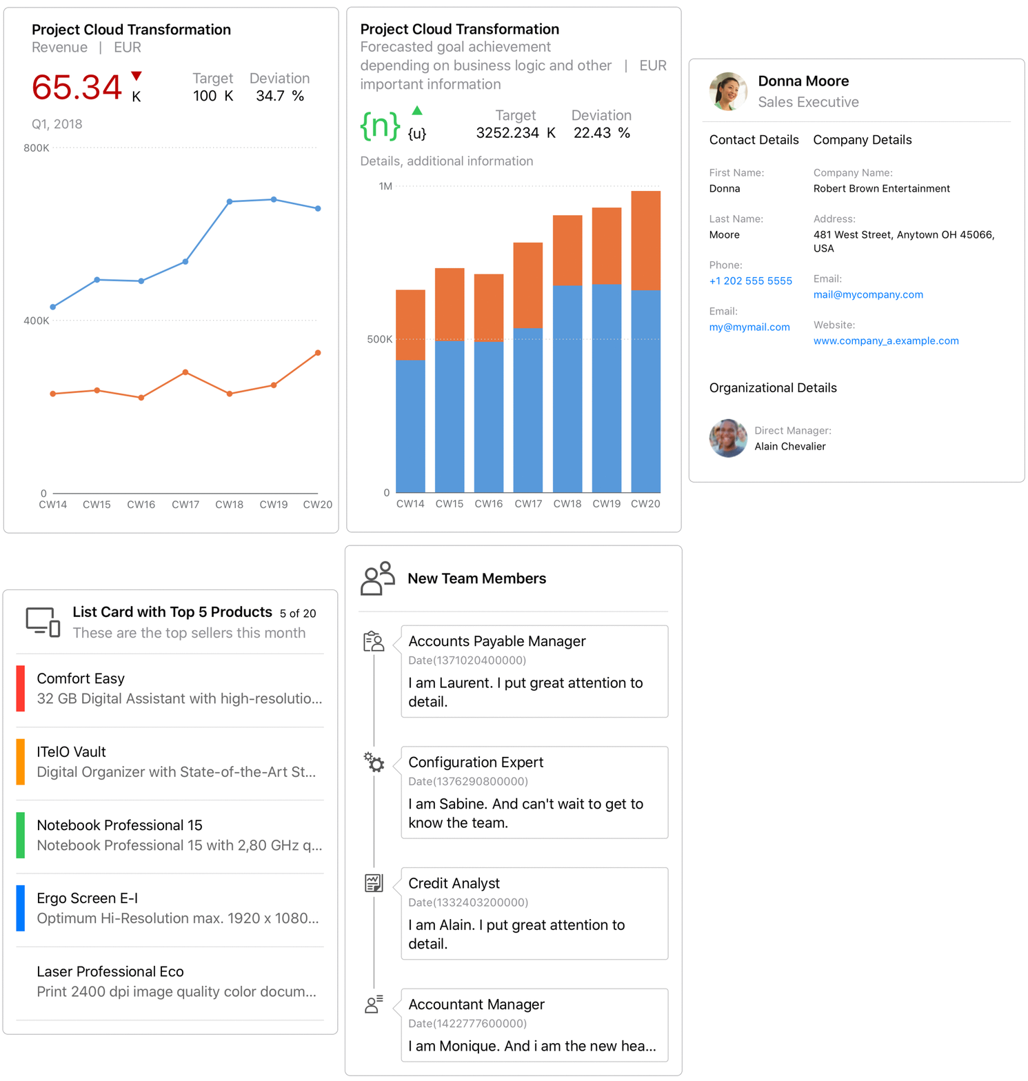
This project currently contains three modules: FioriThemeManager, FioriSwiftUICore, and FioriCharts.
FioriThemeManager

This module provides a color palette and a new font family SAP 72 that conform to Fiori Design Language. It is adopted by all the Fiori components in both this package and SAPFiori.
All Fiori Colors are dynamic colors, which means they will adjust based on iOS Appearance settings (Light/Dark). Accessing Fiori Color using Color.preferredFioriColor(forStyle:).
72 is a SAP patent typeface that delivers great reading experience to our users. You can get these fonts using Font.fiori(forTextStyle:) or Font.fioriCondensed(forTextStyle:). Note that these fonts support Dynamic Type out of the box. If you want the fonts with fixed size, use Font.fiori(fixedSize:) or Font.fioriCondensed(fixedSize:) instead.
Custom fonts need to be loaded and registered during App's runtime. Make sure you call
Font.registerFioriFonts()insideapplication(_:didFinishLaunchingWithOptions:)of yourAppDelegate.
FioriSwiftUICore

This module contains SwiftUI implementation for those UIKit-based components existing in SAPFiori. It provides you with an easy way to migrate your UIKit project to SwiftUI while delivering the same experience as before.
We plan to progressively bring more Fiori UI components into this module in the future releases. Check the table below for the components that are currently available and those in the roadmap.
Refer to this document for different ways of initializing the component.
| FioriSwiftUICore | |
|---|---|
| ObjectItem | :white_check_mark: |
| ObjectHeader | :white_check_mark: |
| KPIItem | :white_check_mark: |
| FioriButton | :white_check_mark: |
| ListPickerItem | :white_check_mark: |
| DimensionSelector | :white_check_mark: |
| SideBar | :white_check_mark: |
| DataTable | :white_check_mark: |
| WelcomeScreen | :white_check_mark: |
| ActivationScreen | :white_check_mark: |
| InfoView | :white_check_mark: |
| User Consent Form | :white_check_mark: |
| KPIProgressItem | :white_check_mark: |
| EULAView | :white_check_mark: |
| ContactItem | :white_check_mark: |
| KPIHeader | :white_check_mark: |
| Signature Capture | :white_check_mark: |
| DurationPicker | :white_check_mark: |
| StepProgressIndicator | :white_check_mark: |
| Text Input | :white_check_mark: |
| Validation View | :white_check_mark: |
| Card | :white_check_mark: |
| Toolbar | :white_check_mark: |
| Search | :white_check_mark: |
| Tab Bar | :white_check_mark: |
| Navigation Bar | :white_check_mark: |
| Stepper | :white_check_mark: |
| Switch | :white_check_mark: |
| Tag | :white_check_mark: |
| Avatar | :white_check_mark: |
| Toast Message | :white_check_mark: |
| KeyValueItem | :white_check_mark: |
| LinearProgressIndicator | :white_check_mark: |
| Information View | :white_check_mark: |
| TextFieldFormView | :white_check_mark: |
| NoteFormView | :white_check_mark: |
| KeyValueFormView | :white_check_mark: |
| TitleFormView | :white_check_mark: |
| Rating Control | :white_check_mark: |
| RatingControlFormView | :white_check_mark: |
| SortFilter | :white_check_mark: |
| Menu Selection | :white_check_mark: |
| ProfileHeader | :white_check_mark: |
| TimelineItem | :white_check_mark: |
| SegmentedControlPicker | :white_check_mark: |
| TimelinePreviewItem | :white_check_mark: |
| DateTimePicker | :white_check_mark: |
| Illustration Message | :white_check_mark: |
| Slider(single and range) | :white_check_mark: |
| Attachment | :white_check_mark: |
| FilterFeedbackBar | :white_check_mark: |
| Switch FormCell | :white_check_mark: |
| Onboarding Scan View | :white_check_mark: |
| Section Header | :white_check_mark: |
| ChartFloorplan | :x: |
| CollectionItem | :x: |
| BarcodeScanner | :white_check_mark: |
| PasscodeView | :x: |
| MultiUserPasscodeView | :x: |
| TouchIDErrorView | :x: |
| Skeleton Loading | :white_check_mark: |
| Value Picker | :white_check_mark: |
| Hierarchy View | :white_check_mark: |
| Calendar | :white_check_mark: |
| Search To Select | :x: |
| Progress Indicator | :white_check_mark: |
| Processing Indicator | :white_check_mark: |
| Checkout Indicator | :white_check_mark: |
| Loading Indicator | :white_check_mark: |
| Feedback Screen | :x: |
| Map | :x: |
| Theming support for UI component individual fields | :x: |
FioriCharts
The FioriCharts module replaces the RoambiChartKit charting library which was already embedded in SAPFiori. Migrating to SwiftUI gives the ability to easily add new chart components (donut, bullet, stocks, etc.) while modernizing the existing supported charts with pinch-to-zoom, pan, and new design features.
| SAPFiori 4.0.x, 5.0.x | FioriCharts | |
|---|---|---|
| Area | :white_check_mark: | :white_check_mark: |
| Line | :white_check_mark: | :white_check_mark: |
| Column | :white_check_mark: | :white_check_mark: |
| Stacked Column | :white_check_mark: | :white_check_mark: |
| Bar | :white_check_mark: | :white_check_mark: |
| Stacked Bar | :x: | :white_check_mark: |
| Bubble | :white_check_mark: | :white_check_mark: |
| Scatter | :white_check_mark: | :white_check_mark: |
| Waterfall | :white_check_mark: | :white_check_mark: |
| Combo | :white_check_mark: | :white_check_mark: |
| Donut | :x: | :white_check_mark: |
| Bullet | :x: | :white_check_mark: |
| Stacked Bullet | :x: | :soon: |
| Harvey Ball | :x: | :white_check_mark: |
| Radial | :x: | :white_check_mark: |
| Stocks (line) | :x: | :white_check_mark: |
The API is designed for backwards compatibility to the existing SAPFiori charting APIs, but is optimized for SwiftUI.
Requirements
- iOS 18.0 or higher
- Xcode 26.0 or higher
- Swift Package Manager
Download and Installation
The package is intended for consumption via Swift Package Manager.
- To add to your application target, navigate to the
File > Swift Packages > Add Package Dependency...tab, then add the repository URL. - To add to your framework target, add the repository URL to your Package.swift manifest.
In both cases, xcodebuild tooling will manage cloning and updating the repository to your app or framework project.
Configuration
Three products are exposed by the Package.swift manifest.
FioriSwiftUI as umbrella product will contain everything the package has to offer in the future.
If you are concerned about bundle size you can use either one of the individual products, e.g. FioriCharts or FioriThemeManager
Limitations
Several functional limitations exist at present, which are planned for resolution in future releases. Please check the Issues tab for an up-to-date view of the backlog and issue status.
Key gaps which are present at time of open-source project launch:
- FioriCharts requires design specifications to improve UI
Known Issues
See Limitations.
How to obtain support
Support for the modules is provided through this open-source repository. Please file Github Issues for any issues experienced, or questions.
When SAPFiori integrates FioriCharts productively, customers should continue to report issues through OSS for SLA tracking. However, developers may also report chart-related issues directly into the Github Issues; SAP will mirror FioriCharts-related issues reported through OSS into Github Issues.
Contributing
If you want to contribute, please check the Contribution Guidelines
To-Do (upcoming changes)
See Limitations.
Examples
Functionality can be further explored with a demo app which is already part of this package (Apps/Examples/Examples.xcodeproj).
